Saturday 17 December 2016

Rogue One: A Star Wars Score

Cover of the Soundtrack to Rogue One: A Star Wars Story. Music by Michael Giacchino

When Alexandre Desplat was originally announced as musical score composer for Rogue One, I was intrigued. Here was a very accomplished, Academy Award-winning composer — whose work to date could has been powerfully rhythmic, but pretty low-key — being asked to write in the tradition of one of the most iconic film scores of all time. Not an easy task. To me, hiring Desplat was a very positive sign that the filmmakers wanted to take these Star Wars anthology films in a very different direction from the saga. Alas, Desplat's place in the Star Wars canon was not be be. In September, it was announced at the last minute that Star Trek composer and J.J. Abrams favourite Michael Giacchino had replaced Desplat.

I felt bad for Desplat, but knew Giacchino is a safer choice for this type of film. Rogue One was touted as a war film, and Giacchino has spent more time writing for World War II-themed properties than almost any other living composer on the planet. Desplat ostensibly departed the project due to 'scheduling' conflicts, but given the talk of reshoots (and the evidence of many scenes in trailers not present in the final film) it wouldn't be surprising if the departure was also due to changes in the film's tone.

Michael Giacchino is a pioneer in multimedia music scoring. The first gig that brought him to wider attention was as composer to the score of the maligned Lost World Playstation game. The game sucked, but the music was great and was indeed the first video game to feature a recorded symphonic score. Giacchino's work on this game led to him scoring the first Medal of Honor game, a game produced by Steven Speilberg and his studio Dreamworks Interactive. Giacchino went on to score the game's sequels, MoH: Underground, Frontline (my personal favourite), Allied Assault (using the pre-existing scores from the other games) and — after a hiatus from the series — Airborne. He also scored the first Call of Duty game, bringing the composer back to World War II yet again. These scores are truly great works in any medium. Giacchino's scored a heap of films and television series since his Medal of Honor days, but it is these early scores Rogue One most closely resembles. The games' heroic themes for the Allies and bombastic goose-stepping marches for the Axis are transplanted into a galaxy far, far away, with a great effect.

The Star Wars series is a natural fit for Giacchino. In fact, he's seemed destined for this role for a long time, with his work on films such as Abrams' Star Trek franchise, Jurassic World and others positioning himself as a natural successor to Williams as the composer who can meld bombast with nuance. Abrams, naturally, opted for John Williams to score The Force Awakens so Giacchino — a long-time Abrams collaborator — was cast as a stormtrooper in the opening on Jakku instead.

Which brings us to Rogue One. Fans looking for a rehash of themes from the original trilogy will be disappointed. This score is almost wholly originally. The cover of the album may credit John Williams as the "Original Star Wars music" composer, but this is mainly a marketing exercise. Just as the film uses iconic characters sparingly, so too does Giacchino quote Williams' themes infrequently, but judiciously. Instead of dumping in the Imperial March every time a Star Destroyer appears on screen, Giacchino very smartly develops his own Imperial themes, derived from those of A New Hope, rather than the Imperial March of the Empire Strikes Back.

There was disquiet about Williams' use of the Imperial March in the prequels, owing to the fact that in the timeline of the films, neither the Empire or its theme had been established. Giacchino wisely quotes from it sparingly and instead chooses to develop the Death Star's four note motif (duuh duh-duh DUUUUUUH) and even employs Darth Vader's original motif (sometimes called the 'Imperial motif', but referred to a pre-ESB Williams as 'Darth Vader's Theme') of bassoons and muted trumpets which has not been heard since the original 1977 film.

Imperial Motif or Darth Vader's Original Theme from the 1977 film Star Wars. Music by John Williams

All in all, this is a very good score that serves the film exceptionally well. The same people who threw the banal critique at The Force Awakens soundtrack as not having a 'hummable' tune will probably dislike this score. There probably isn't enough Williams for the casual viewer's liking, and interweb-based film score forums (yep, such things exist) will issue keyboard criticism after keyboard criticism, but this is a very good score. As Gordy Haab (Battlefront), Mark Griskey (The Force Unleashed), Joel McNeely (Shadows of the Empire) and other composers have shown, there can be exceptional Star Wars scores without the original maestro at the helm. Sooner or later John Williams won't be around to compose a Star Wars score; we were very lucky to get a seventh saga score from him. I can't think of anyone better than Michael Giacchino to inherit the Star Wars musical mantle.

Highlights: 
Krennic's Aspirations — The re-emergence of a very familiar character and some very familiar themes.
Hope — Once you've seen the film, the opening of this track will probably give you nighmares. It's instantly iconic and will be a track long remembered, to paraphrase a certain memorable villain.
The Imperial Suite — a concert version of Giacchino's new themes for the Empire, like an ur-Imperial March. A lot of similarities to some tracks from MoH: Airborne.

Other Albums You Should Listen to:
Medal of Honor: Frontline (Apple Music, Spotify, YouTube)
Medal of Honor: Airborne (Apple Music, Spotify, YouTube)
Battlefront OST, Gordy Haab (YouTube)
The Force Unleashed OST, Mark Griskey (YouTube)
Shadows of the Empire, Joel McNeely (Apple Music, Spotify, YouTube)

Monday 12 September 2016

Say NO to Lif3


​There's a wonderful section in the late Christopher Hitchens' Letters to a Young Contrarian where he discusses a daily ritual of frustration that made him feel alive. Every morning, he would sit down to read the New York Times, checking whether the 'bright, smug, pompous, idiotic' motto 'All the News That's Fit to Print' was still there to the left of the masthead. Yes it was. Did it still irritate him? Yes. Then at least he knew he still had a pulse.

I also indulge in a "daily infusion of annoyance", perhaps it is a form of secular self flaggelation. Mine is to visit the Twitter page for Lif3 Smartchip, a $70 piece of snake oil-infused plastic that protects you against the imagined dangers of mobile phone radiation. Because health. And the children. And the health of children. And really, don't you want to protect the children?

Never mind the fact that the overwhelming volume of evidence indicates electromagnetic radiation from mobile and cordless phones, Wi-Fi routers and other 'smart' devices isn't dangerous to human health. Never mind the slight inconvenience that there's no known biologically plausible mechanism for low power EMR to damage cells. Never mind the sober recommendations of the vast majority of national and international health bodies which indicate there's no reason to be concerned about EMR radiation. But overwhelming evidence aside, as Lif3 themselves say, 'why take the risk?' It is, of course, much easier to make a quick dollar by ignoring decades of evidence. Oh, and did I mention the children?

Daily I will visit Lif3's Twitter account and if I can still exclaim, under my breath, why do the insult me with their moronic claims and what do they take me for and why do they bother with their snake oil BS — all while earning the eye-rolling ire of my patient wife — then I know I too still have a pulse.

Unfortunately I can't check Lif3's Twitter page when logged in to my own Twitter account. I have to either log out or use private browsing because these fine corporate citizens have blocked me, along with many others who dared to question their pseudoscientific snake oil. But at least they're thinking of the children...and their parents' wallets.

Sunday 21 August 2016

Melbourne: Most Insecure City in the World

Eureka Skydeck, 2013

The Economist Intelligence Unit has named Melbourne the "Most Liveable City in the World" for the sixth straight year. Huzzah! Break out the champagne, but just make sure it's a 1996 Bollinger La Grande Annee Brut. What? You can't afford a $600 bottle of champers? Then too bad, because these rankings aren't for you.

Despite social media crowing from every civic leader from the Premier down, the "Global Liveability Ranking" means very little by itself and means even less to those who already live in those benighted cities fortunate enough to make the cut. Melbourne, like the rest of Australia, is desperate for external—preferably foreign—validation, has taken these rankings and run with them for decades, without actually thinking about what they mean. 

The beneficiaries of this aura of "liveability" are the executives earning a whole heap more than you. These global rankings are generated by the Economist Intelligence Unit, the sister company to the more well-known magazine. The goal of the EIU is to help "businesses, financial firms and governments to understand how the world is changing and how that creates opportunities to be seized and risks to be managed". Translation: they don’t care whether your local public school is falling down, only whether there are quality private schools nearby for executives with expense accounts to send their little darlings to.

The rankings are devised for senior executives schlepping into town (in business class, of course) for a two-year stay to restructure the local business (synergise efficiencies and such, the action formerly known as sacking people) before leaving with a well-earned pay raise and a promotion.

The people for whom these rankings are divined will not be searching for an affordable home within a 60 minute drive of the CBD, nor will they be worried about the quality of public education from their nearest state school. They won't be struggling to find amenable employment or efficient public transport because the issues that matter to you and me will be looked after by their cashed-up, tax-dodging multinational employers. 

Don’t just take my word for how meaningless these rankings are, take a look at this quote from EIU themselves on the top 65 “Most Liveable” cities: “Although 17.2 percentage points separate Melbourne in first place from Warsaw in 65th place, all cities in this tier can lay claim to being on an equal footing in terms of presenting few, if any, challenges to residents’ lifestyles."

Soooo basically, tax-dodging multinationals, you can send your overpaid staff anywhere in that top 65 and they will likely not be stabbed or robbed or fleeced and <zinger>will be free to do same to the local government </zinger>.

This is not to say Melbourne isn't a great city—it is. We have great healthcare by international standards, pretty good schools and an abundance of decent coffee [note to self: pitch EIU Global Coffee Index]. But it's strange to think of Melbourne being up there with Vienna. Both are nice cities, but Vienna has a proximity to Europe that Melbourne simply can't match. It is also the home of many international institutions and global initiatives that are simply more important to the world than, say, the Australian Open. It also has dumptruck loads more culture than Melbourne, a functioning public transport system (one that has been updated since the 1930s) and, most importantly, the Leica Shop.

But remember, regardless of how relevant this ranking is, we still beat Sydney. And that’s the important take home lesson from all this: Sydney sucks.

Tuesday 16 August 2016

Imperial Evidence

Well done, voters of Queensland (ABC)
I'm usually fairly derisive of Q&A. I regularly admonish its fans and audience as being part of #QandAland, a happy land where harsh political realities cease to exist and we all sing kumbaya around a camp fire, holding hands with a leather-jacketed Malcolm Turnbull who has taken his rightful place as the leader of the Liberal Party (polite applause).

Most of the time, it is a pretty terrible exercise in inertia that gives Fairfax its main news stories for the next week. Sure, it's fun seeing Richard Dawkins and "Big" George Pell field incendiary questions about how evolution is just a "theory" or if an atheist can be a good person, but it's less a debate than a sideshow. There will never be a middle ground reached—there can't be—and the producers are perfectly happy to keep it that way.

Occasionally, however, the show can be revelatory. Duncan Storrar's questioning of a hapless Kelly O'Dwyer demonstrated how out of touch the Turnbull government was (and is), and how low the Murdoch papers will stoop with ad hominem attacks on those who disagree with their noxious world view.

Last night's National Science Week-themed Q&A also offered some gems, along with a great lessons in how to deal with the incurious, ignorant, chemtrail-addled obscurantist bore in your life (c'mon, we all have at least one).

Simple rule: don't argue with Professor Brian Cox unless you are discussing something which is impossible for him to have knowledge of, like the number of cracked Ikea coffee mugs in your cupboard (although he could probably give you a global mean) or on the finer points of Australian New Wave cinema.

One Nation lunatic-elect Malcolm Roberts gave a textbook performance as a conspiratorial nutjob. He challenged Professor Cox to present "empirical" evidence of climate change (it's almost like Malcolm knows what those words mean), and when presented with said evidence, claimed it was doctored. It's classic conspiracy believer stuff, with evidence against their tinfoil worldview appropriated as evidence for their conspiracy.

Think moon landing hoaxers: for them, the extensive photographic and data record of the Apollo program is fabricated, therefore this evidence the average person considers supports the moon landing is seen as evidence against the moon landings in the conspiratorial mind. Any evidence presented by authorities in inherently untrustworthy because it comes from Big Pharma, Big Farmer or the Guvment or Big Space (which is how I assume they refer to NASA).

Even though Brian Cox would have known he would be unlikely to alter Roberts's unfalsifiable position by presenting actual evidence, Cox's approach is a good one to keep in the critical thought toolbox when dealing with nutcases.

First off, Cox presented data. Now, presenting data almost never whips your a conspiracy-minded opponent into contrition, but it's worth a try. At least you know you have evidence to support your contention.
Secondly, when Roberts inevitably objected to the data, Cox asked specific questions as to why he objected. When Roberts claimed the data had been "corrupted" and "manipulated", Cox asked "by who?" By NASA, of course.
For many observers, this will be enough to demonstrate your opponent is a loon. Indeed it was enough for the residents of #QandAland to start laughing. Conspiracy theorists are, by and large, great at creating a compelling macro-scale worldview, but are woeful at detail. Once again, this doesn't change the mind of the conspiracy theorist, but it does deny them credibility among reasonable fence-sitting people.

For #QandAland, this is probably just the first appearance of many by this particular One Nation loon-elect. In an effort to concoct a sense of "balance", the ABC has gone out of their way to make sure fringe individuals like Pauline Hanson and Lyle Shelton get oxygen on programs like Q&A and The Drum. It is even less reason to engage in the alleged "debate" the show engenders.

I think Brian Cox said it best last night on the show when trying to communication the Australian Academy of Science's climate change report to Sovereign Idiot-elect Roberts: "...you can never get any sense on programs like this. They're adversarial things..."

I couldn't have said it better myself.

Ultimately, you're unlikely to change the closed mind of a deliberately ignorant individual. As a rational being, you're already at a disadvantage compared to the science denying loon because you require evidence to support your claims—the denier does not adhere to such inconvenient niceties. No amount of peer-reviewed evidence is going lead someone like Roberts along the road to a Damascene conversion.
But not everybody out there is intentionally ignorant. Sometimes, people just receive bad information and carry it with them. So here's advice from UQ PhD student Diana Lucia, as offered on Radio National's Ockham's Razor:
...next time you’re at a dinner party and find yourself sitting next to a science denialist, return the favour, latch onto every illogical inconsistency they throw at you and force them to address it. Find out exactly what they object to and where they have been getting their information from. I doubt you’ll force them to have a sudden epiphany by the time dessert is served, but you can be part of the process that breaks down the barriers to begin to change people’s minds. 

Until next dinner party...

Good resources:
How to Talk to a Climate Skeptic: Responses to the most common skeptical arguments on global warming, Grist.org
Science deniers use false equivalence to create fake debates, Skeptical Raptor
Don’t let denial get in the way of a good science story, The Conversation

Saturday 13 August 2016

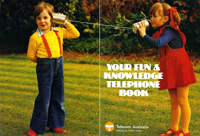
Telecom Australia's "Fun & Knowledge Telephone Book"


Consider this my gift to the world.

I have a saved search in my eBay app for "Telecom Australia". Don't ask me why, but I think it has something to do with a time long gone when governments actually owned and built things, rather than making excuses for why they can't or shouldn't.

I'm not saying government-owned monopolies didn't have there problems, but on the other hand, there's little doubt the decades-long regimes of privatisation have left a lot to be desired. With privatisation has come the privation of job security and indeed labour security of any kind.

At Telecom's privatised and <sarcasm> greatly loved</sarcasm> successor, Telstra, a new CEO is installed every few years and undertakes the review to end all reviews. They try to find new efficiencies (read: people to sack) and ways to "foster relationships with [their] key stakeholders, operate at best practice in issues management, build [their] reputation through ongoing promotion of positive activity, and leverage our technology and expertise to make positive contributions to the community" (actual line from Telstra's 2015 Annual Report, p.17).

After all, what else screams "SUSTAINABILITY" than embedding "...social and environmental considerations into our business in ways that create value for the company and our stakeholders" (ibid. p.27).
But I digress, on one of my eBay searches, I found this delightful publication: Your Fun & Knowledge Telephone Book. It's a freaking Telecom colouring and activity book. How could I not?


Ostensibly I have bought it for my son, but really I have bought it to gift to all you as well so that the imperfect past can be remembered into an uncertain future.

I've scanned each page using my Epson V700 and lovingly cleaned it up so that you too an learn about the history of the telephone and the new technology called "touch tone".

After you've read the books, colour in the pages!

Tuesday 17 May 2016

Book Review: NASA Graphics Standards Manual


Graphic designers Jesse Reed and Hamish Smyth have been busy. In addition to their day jobs as associate partners at iconic design firm Pentagram, they have been reprinting and reissuing old and seemingly mundane graphics standards manuals – guides made by designers and issued to clients to establish unity and consistency across visual communications – in sumptuous new editions.

First was the pair’s reissue of the New York City Transit Authority’s Graphics Standards Manual, Massimo Vignelli’s and Bob Noorda’s iconic and comprehensive redesign of the New York subway signage and identity. An original ring binder version of the manual was was found in, of all places, a basement locker at Pentagram. Reed and Smyth immediately recognised its brilliance not only as a functional manual, but as a piece of design in its own right. After scanning the manual page-by-page and presenting it online, they crowdfunded a limited print edition which lovingly (and accurately) reproduced the original manual better than ever. Like many major projects of this scale, the politics behind the project is often just as interesting as the designs themselves. The NYCTA Manual is no exception, with the long, storied history of Vignelli and Noorda’s work the subject of Christopher Bonanos’s fascinating essay included with the crowdfunded print edition.

Now the pair have turned their sights heavenward with a reissue of the NASA Graphics Standards Manual – the source of the famous (or infamous) red “worm” logo. In 1974, Richard Danne and Bruce Blackburn of firm Danne & Blackburn responded to a request from NASA for a corporation-wide rebranding. This rebranding was part of an ambitious effort sponsored by the federal government to improve and, importantly, humanise government agencies; a project creatively named the Federal Graphics Improvement Program.

(L–R) NASA Seal 1958–present; NASA insignia (the "meatball") 1958–1975, 1992–present; NASA logotype (the "worm") 1975–1992
Since the late 1950s, NASA used its famous (again, or infamous) “meatball” logo, consisting of heavy serifed letters, a space capsule orbiting the letters, a red arrow and various other symbolic iconography. It was (and remains) complex, difficult to accurately reproduce and was not designed for a technological era where computers were playing a greater part in reproduction of designed elements. Fax machines and photocopiers couldn’t reproduce it properly and it looked terrible at smaller sizes. Design wise, it was a corny mess of comic elements unbefitting of the most forward-looking agency in the world. Such a design would not do; it could not do.

I won’t go into too much detail about the life and times of Danne & Blackburn’s masterful creation – Bonanos’s included essay again does a much better job at that – except to say that while the logo (and associated graphics standards) was and remains a thing of beauty, many at NASA hated it. By 1992, the new administrator Dan Goldin decree that everything old would be new again, and the meatball was reinstated as the official NASA logo. The worm would be nothing more than an experimental interregnum, irrevocably bound up with disasters, like Challenger, of 1980s NASA. The future was now the past and the only way forward was backwards, to hark back to the golden era of NASA and the Apollo programme. Or so it might have remained had our über design nerds Reed and Smyth not given the NASA Graphics Standards Manual the same tender, loving and caring reproduction they had done with the NYCTA manual.


Which brings us to the reproduction itself. First off, it is an object of extreme beauty. The book just oozes quality and Reed and Smyth’s passion for not only this manual but for book design in general is evident from every facet of the delivered physical object. The book arrived packaged in a “static shielding” pouch; a shiny sheath that couldn’t be any more “space age” short of being launched on a shuttle and returned to Earth. It’s also a material that would be immediately familiar to anyone who has worked with computer components that come sealed in such a material when new to avoid damage from electrostatic discharge. Very suitable for this book.

Upon removing the book from said shiny pouch, we are treated to the worm in all its red glory. Interestingly, the red is only specified as “solid red plus solid yellow”, but each copy of the original Manual included a page of “NASA Red” perforated swatches to send to printers and designers to match, a page lovingly reproduced in this reprint, although sadly not perforated!


The opening pages are given over to a forward from designer Richard Danne and the aforementioned essay from Christopher Bonanos – both detailed and necessary contributions that add a great deal of context and value to the manual that follows.

Each page of the manual has been reproduced in the best possible quality, but remains unaltered. It is presented exactly as it would have been seen in its original form: recto printed with the hole-punched edges visible on each page. Even the tabbed dividers are reproduced in full. What was most surprising were the fold out pages, the first of which featured a large grid drawing of the worm for large applications. It’s a great throwback to the pre-desktop publishing era when such sheets were indispensable for accurate, reproducible design. It took me back to the lettering books that were all the rage with us kids in the early 1990s, before WordArt came along and destroyed literally everything good about desktop design. There is little I hate more than Microsoft Word and I will curse it with my dying breath.

But I digress, these fold out pages – all ten of them – are quite something. Each provides important details for application of the identity, from an introduction to layout grids, to how building signage should look and even to the worm’s placement on the space shuttle. Sploosh.


The final few pages feature reproductions of the initial presentation given by Richard Danne and Bruce Blackburn to NASA executives in 1974. These pages stand out as they are printed on full-bleed black. The quality of the printing and the stocks is exceptional. This is a striking design choice, evoking the feeling of sitting in a darkened (and probably smoke-filled) room and seeing these 35mm transparencies projected before you. Well played, Reed and Smyth.


As mentioned in Bonanos’s essay, this meeting resulted in Danne & Blackburn winning the job, but also at this very early stage, perhaps revealed hints of NASA management simply not getting the design. When the designers asked for the executives’ feedback, Richard Danne recalls one exchange between NASA administrator Dr. James Fletcher and his deputy Dr. George Low:

Fletcher: “I'm simply not comfortable with those letters. Something is missing.”
Low: “Well, yes, the cross stroke is gone from the letter A.”
Fletcher: “Yes, and that bothers me.”
Low: “Why?”
Fletcher: [Long pause] “I just don't feel we are getting our money's worth!”

And then, a few minutes later:

Fletcher: “And this color, red, it doesn't make much sense to me.”
Low: “What would be better?”
Fletcher: “Blue makes more sense ... Space is blue.”
Low: “No, Dr. Fletcher, space is black!”

Anyone who has presented new ideas to managers would probably recognise an exchange of this sort. Even NASA ain't immune to that shit.


As a visual identity document, the Graphics Standards Manual is comprehensive. It lays out virtually every possible usage of the worm logotype. Most importantly for a document of this sort, it is accessible to the design layperson, even (or especially) if that person is literally a rocket scientist. In fact this is one of the great mysteries of the worm saga: why many at NASA, people who literally built the technology of the future, never took to this futuristic logo.

There was a strong amateur graphic design ethos at NASA: each mission patch was designed by the astronauts themselves and even the original NASA seal and meatball was designed by an amateur, James Modarelli, the head of Lewis Research Center’s Reports Division. To these rocket scientists (and engineers and physicists and chemists and administrators and comptrollers etc.), NASA’s logo isn’t about a consistent corporate identity, in fact such a concept is anathema to such a group. It was about something more human: the NASA family. Sure, the meatball was corny, but it was homely, and had been there through the good times and the bad.

For if you're ever confused where to put your worm on your Hubble Space Telescope
If that’s the case, then this whole Graphics Standards Manual speaks to an even more exciting time, when creating a new identity meant creating a new purpose: reshaping the future. The worm really speaks to the power and the optimism of design that is lost in today’s constant churn in identity and design (ugh...Instagram, what have you done..??!!).

Reed and Smyth have done a tremendous public service by reissuing this manual. It’s not just about good design, it’s about the potential for design to change things for the better. However, design can’t exist in a vacuum (ha), as the restoration of the meatball demonstrates. Design is subject to the whims of humans, just as it is reliant on those same people for its creation and implementation. Design needs humans and even the best design can be brought down by the people who created it.

Pages of typefaces make Richard happy
Interestingly, just as Reed and Smyth were working with Richard Danne to publish their reproduction of the Graphics Standards Manual, NASA released the original in PDF format on their website. Coincidence? I doubt it. Methinks there may be some passionate design nerds at NASA who would dearly love to see the worm back, and this was one way to honour the work of Danne & Blackburn.

Naturally, people inside and outside of NASA have very strong feelings about their logo. NASA is no normal agency – ask me my feelings on ATO or ASIC corporate identity and I will struggle to give you two shits – it is an agency which stokes the imaginations of entire generations around the world. To me, the worm is NASA. It’s what I drew on space shuttles and fantastical spacecraft of the imagination as a kid, even though the worm had been confined to the design dumpster of history a couple of years earlier. It’s the identity of the NASA I saw popular culture growing up: in movies such Flight of the Navigator and Space Camp (don’t judge me); in hours of documentaries, and pages upon pages of books and news stories. I was and remain a gigantic space nerd and there was nothing in my experience more futuristic than the four letters of the worm.

But now everything old is new again, and as comes with so much of today’s thoughtless appropriation of the past, we praise the past with little thought for the future. As the terminator of the worm, administrator Dan Goldin said when reinstating the meatball in 1992, “the magic is back at NASA”. Sadly, I reckon it was on its way out.

The Worm: 1975–1992. Forever in our hearts and imaginations.
National Aeronautics and Space Administration Graphics Standards Manual
Published by National Aeronautics and Space Administration, 1975
Reproduction by Jesse Reed and Hamish Smyth
Published by Standards Manual, LLC, 2015
ISBN: 9780692586532
Extent: 220pp
Hardcover, case-bound, with silver static shielding (plastic polyethylene terephthalate) pouch

Sunday 8 May 2016

Election 2016: So Very Tired

Governor-General Sir Peter Cosgrove regaling Prime Minister Malcolm Turnbull about how big the one that got away was (Facebook)

Making predictions about an election and its outcome is a stupid thing to do. So here goes.

Turnbull is toast. There is no other way I can put this, regardless of the outcome of the election, he is gone sooner or later. Why? Well, if the Liberal Party loses, Turnbull loses. Duh. But if the Liberal Party wins, but only does so with a reduced majority (a current likely outcome), whatever authority the PM has left in the party room falls away thanks to the emboldened Abbott delcon (delusional conservative) rump.

These delcons would (delusionally) be able to claim that the switch to Turnbull did nothing to improve the government’s electoral performance. Of course the reality is the switch to Turnbull gave the Liberals a fighting chance when they were heading for almost certain oblivion under Abbott. Everyone else knows this, hence why this rump is termed delusional. These delcons would view a less-than-resounding win for Turnbull as a win for their brand of fringe politics. As they have done for the past eight months, they would continue to make Turnbull’s political life a living hell. On every issue at every opportunity, they’ll be aggressively ensuring Turnbull sticks to the deals he has made with the delcon devils on issues such as marriage equality, sex education and carbon pricing. These compromises, which have perhaps irreparably damaged Turnbull’s public standing (particularly in #QANDAland) have been his price of power. A few months ago, Turnbull could have counted on an increased majority to stifle dissent within the ranks, but barring a major stumble from Labor, such a scenario is difficult to imagine.

For Turnbull, winning is insufficient. He must win and he must do so with a thumping majority. Anything less means a replay of Labor in 2010...and possibly a return to the Mad Monk.

Friday 6 May 2016

A Magazine from Blurb


In my last post, I spoke about my most recent experience producing a Blurb photo book as a family album. The album was of a very high quality, however the price was on the high side. If you want you photographs in print (which you absolutely should) there is another option.

In addition to photo books, Blurb also offers other book formats including trade paperbacks (best for text) and magazines. While the magazines don't have quite the print quality of the dedicated photo books, they offer a cheaper alternative for getting your photos printed and bound.

This is the option I took at the end of 2015. With the (very) recent arrival of our first son, I knew time and money for gifts would be at a premium for Christmas. So I prepared a magazine with photographs from the previous 12 months to give to family, with space for one very important 6x4 of our new arrival at the back, who came just too late to be included in the magazine proper.

Although the images from 2015 were more fresh in my mind than previous years, it was no less rewarding going through my catalogue, reassessing previously discarded images, and building a good selection of images. Once again, I undertook the magazine layout in Adobe InDesign, affording me much more design flexibility than with Blurb's own in-house software (I must stress though that Blurb's own software is thoroughly decent if you just want to make a basic photo book from a selection of photographs. But if you have any Adobe skillz at all, InDesign is worth the effort).

140 pages later, I had a magazine. 140 pages may stretch the definition of "magazine", but Blurb's print services can handle it and that's all that matters. Oh that and the familial reception. They loved it; it spawned the usual "oh Richard it looks so professional you should do this for a living because it's so professional" question/statements that ignore the practicalities of profitable publishing. My 104-year-old grandmother sits it proudly on her table, telling me every time how much she "thoroughly enjoys" reading it.


It's nice to have an appreciative audience.

And it's nice to have a physical thing. Yada yada yada, DIGITAL DARK AGE, yada yada yada. No shit, you will lose your shit at some point. Shit being your bits and bytes of data. Either through neglect or nefariousness. A physical printed thing is a hedge against that.

Besides, a physical product like this one is pleasurable to read again and again. You don't read them every day, but it's much nicer flicking through them and reminiscing than swiping through 12,397 images on your tablet/smartphone of choice.

REPENT

REPRINT!


A Photo Book from Blurb


It is difficult to overstate the importance of the physical object in the digital age. As a photographer, that means the importance of the print. The ephemeral nature of data means that already many of our memories and much of our information – that used to be physical – have disappeared. Some are already warning of the "digital dark age", an age where there has never been a greater saturation of recording devices and data, yet we have never been at greater risk of losing it all forever.

This is why it has never been more important to print. Print isn't forever, but it's for a damnside longer than data. Data comes and goes, data becomes corrupted, data gets deleted, reformatted, rendered obsolete by the march of progress (and of marketing departments). A print may get torn or creased or scratched or fade, but there is usually still something left to be seen, to be interpreted. A fragment that is not a slave to the technology of the day. All you need is vision and light. That is why I have been making a concerted effort recently to make more physical things, both photographic prints and photo books.


Blurb is a well-known provider of print-on-demand book publishing services, particularly targeted at one-off publications such as family albums and low-volume photo books. I am a regular user of Blurb, having printed my first book with them back in 2011. Since then I've printed books with a variety of papers and bindings for a variety of purposes. Some have been consciously "professional" photo books, others have more family album-oriented in their content.

It has not always been smooth sailing with Blurb, however. Their print quality back when I first started using them left a lot to be desired, and I've had to return two books because of printing blemishes and errors. But when these problems have occurred, the customer service has always been excellent and rectified the problem promptly.

Most recently, I've been taking the time to collate my vast catalogue of digital images and print something of a yearly album. This most recent album covers almost exclusively 2011. I am trying to give each its own personality, reflecting some of the content inside the album. In this most recent publication's case, it was a year spent mostly at home with study occupying most of my time. Hence the Melway-inspired cover (colours and patterns of the 1993 edition, one my dad kept for far too long in his 1981 Ford Laser).


The downside to Blurb is that they are not particularly cheap. Luckily, they have regular vouchers offering up to 40% off. While these offer good value, I would think these vouchers have conditioned customers to wait until the next promo code comes around to upload and order their books.

Book making is a great experience, however you do it. It is particularly rewarding going back through the archives and discovering photographs you don't remember taking. Indeed it's difficult to resist reopening old files and making new edits. Sometimes you look at a photo just shake your head and think to yourself "what was I thinking!?". This tinkering can be good and bad, although even with years more experience, I found myself more often than not keeping the old edits.


The Digital Dark Age is upon us.

Repent!

Or should I say...REPRINT!

P.S. the book pictured above is not available publicly on Blurb, it's a Richard-only special

Friday 29 April 2016

A Spotlight on the Dictionary


My 7-year-old Macbook Pro keyboard has seen better days (some keys are also about to fall off in addition to those that already have)
I don't want to turn this blog into an Apple complaints board, but a few things have been bothering me as I've been looking for new devices on which to type and write and such.

I like writing. I don't even mind typing. Sure, I prefer the black ink of my Lamy or the clickety-clack of my Apple Extended Keyboard, but I will usually make do with anything. After all, writing is not just the tools you use, it is a state of mind.

I could "write" on my iPhone, if I wished. And indeed I have been known to make notes on there from time to time. But as an object, it doesn't inspire anything "writerly" within. It doesn't look like it's comfortable doing the "writing" thing. It looks like it wants to put away its tiny (and progressively more useless) touch keyboard and go back to being a time-wasting brain hole of food pictures, selfies and #blessed.

With my 7-year-old Macbook Pro on the fritz, the 9.7" iPad Pro looked tempting...until I discovered its awful flaw.

As a Mac user, I utilise a feature called Spotlight with almost reckless abandon. ⌘+Spacebar brings up a search bar allowing me to search for anything across the entire computer. I will search for application names and open them much more quickly than navigating to the application menu with the mouse ("You mean you have to use your hands??" "That's like a baby's toy!").

Spotlight will search file names, file contents, email contents, the internet and even the dictionary. It is this last function I find most useful when writing. Once a word is in the Spotlight search, a simple ⌘+D will open that word in dictionary where I can venture into the world of language. This is not just about definitions. The in-built thesaurus is a writer's delight, allowing quick and easy access to a superabundant repository of auxiliary expressions.

iOS, the operating system of the iPhone and iPad, also offer Spotlight, but for some reason do not offer dictionary integration. This is a shame because unlike the desktop OS X, there is no stand-alone dictionary application on iOS, only preinstalled dictionaries that can be accessed when you wish to "define" a word.

This tiny feature is what is stopping me from buying an iPad Pro. Well, that and I don't have the cash, but right now, I'm not even aspiring to one because of this little flaw. And that's a shame humiliation ignominy pity, because it is a really nice piece of technology that is incredibly portable and potentially very useful for writers. I guess we can always wait for version 2.0...


Monday 25 April 2016

Borderlands

English Bluff Rd – Google Street View
10 English Bluff Rd. It’s a pretty standard two-storey suburban house on a pretty standard suburban street. The asphalt is in okay condition although is a little pockmarked. Maintenance is probably not high on the agenda, given the little traffic this end of the road receives. On one side, number 10 is bordered by Georgia Wynd, another like suburban street, greenery-lined and rather verdant. But on the other side, there is something that makes number 10 unlike almost any other suburban house in the world. You see even though English Bluff Rd is termed a “road”, it is not actually a thoroughfare.

Number 10 sits at the end of English Bluff Rd, but there is no geological reason that prevents it from continuing on its way to numbers 8, 6, 4 and so on. There is no cliff, no hill, no unfordable raging torrent, no insurmountable topographical feature, just a strip of foot-tall concrete kerbing – painted yellow – and a yellow and black checked diamond sign atop a no parking sign. Next to all this is another small sign:

WARNING!
If you are entering the United States
without presenting yourself to an Immigration Officer,
YOU MAY BE ARRESTED AND PROSECUTED
for violating U.S. Immigration and Customs Laws.

English Bluff Rd can go on no further because of a political obstacle, an invisible line drawn arbitrarily across the Tsawwassen Peninsula along the 49th parallel by men of two nations in dispute over two centuries ago. Here the Americas were divided by the British and the United States, today forming the border between British Columbia, Canada and Point Roberts, Washington, USA. And while there are plenty of border crossings between the United States and Canada across this imaginary line, there is none quite like the one at the end of English Bluff Rd.

The Oregon Treaty of 1846 extended the boundary between what would become Canada and the United States along the 49th parallel from the Georgia Strait all the way east to the Rocky Mountains. The 49th parallel cut right across the southern tip of the Tsawwassen Peninsula and while an agreement was met between the parties to bend the border around the southern part of Vancouver Island – keeping that island entirely in British territory – such an accommodation was not made for the tip of the Tsawwassen Peninsula.

This southern tip fell below the 49th parallel and as per the Oregon Treaty, became part of the United States. Thus Point Roberts became what geographers term a practical exclave; a part of the USA reachable by land only via Canadian roads. Indeed it's much closer to downtown Vancouver than the nearest major US town. But this doesn't stop the school buses full of US school children from getting a US education. They travel every day over the border into Canada and re-enter the United States at Blaine, before reversing the journey in the afternoon. Similarly, Canadians pop across the border to buy cheaper petrol, groceries and consumer goods where US retailers won't ship to Canada.

The portion of the Tsawwassen Peninsula that falls below the 49th parallel is only 3km from north to south and about 5km east to west. The total area of this tip of America is only 12.25 km2, an area roughly equivalent to Melbourne's CBD and immediate inner suburbs.

To an ausländer, this border and its polite sign is truly bizarre. Like many, I am used to seeing images of the Mexican border in pop culture: a frontier no-man’s-land that Donald Trump wishes to turn into a modern concrete and iron curtain.

But here in Point Roberts, this most fortified of national borders is little more than a few feet of concrete and a sign. No barbed wire, no land mines, no watch towers.

Or so it would appear.

There is more to this border points than meets the all-seeing Street View eye. While the end of English Bluff Rd where Canadian asphalt meets the 49th parallel may look like little more than an gentle barrier, technology makes it more fortified than ever. The modern surveillance panopticon means there can be eyes on the ground even when there are not actually eyes on the ground. They might be cameras on poles or even in trees, but somebody is always watching. 

Even pressure sensors are said to line the border, making this invisible barrier a barrier that is truly invisible. A simple jump across any of these deceptively empty strips of land may likely result in a prompt visit from US Border Patrol, helicopters blaring overhead. Just because the overt symbols of surveillance and control aren’t there, doesn’t mean they’re not watching.

It's this security that makes Point Roberts one of the most curious gated communities in the world. In addition to its cheap (for Canadians) petrol, it's apparently a regular home for those in US witness protection programmes.

There are plenty of US/Canada border towns, all of them more secure than a cursory glance might suggest. In Abbotsford, British Columbia, two roads run side-by-side, each adorned with a slightly different yellow line marking, for one is in Canada and the other in the United States. All that lies between them is the legacy of history and a 2-foot-wide strip of grass.

Stanstead, Quebec is another, sitting right across from Derby Line, Vermont. For decades, these two towns have spread geographically with little regard for the imaginary line of long-dead statesmen. The towns’ library and opera house was built straddling the border, so that citizens of both sides could use it. Likewise families and friends built lives with little regards for the map. Neighbours would share a lawnmower or beer, even if there did happen to be an invisible line bisecting their lives.

For years, this was how things were, but in the surveillance era, even casual transgressions of the line are not permitted. The painted line on the road is no longer a symbolic line, but an enforced division. US Border Patrol monitors the streets, having blocked off a number of “unguarded” roads. The US border authorities call the Stanstead/Derby Line region a “unique challenge” – that’s law enforcement parlance for “we’re cracking down and cracking down hard because terrorism”.

It makes me wonder, if Australia had land borders, what would they be like? Despite our secure island geography, Australians are inordinately afraid of the “other”. How Australians enforce their maritime borders might provide an idea of how we would enforce our hypothetical land border.

I think it would be fair to say this imaginary border would bear more resemblance to the USA’s Mexican border than its Canadian border. No small signs asking you to go the long way around to “present” yourself to a member of Dutton's Team Border Force.

Instead I imagine dogs and razor wire and landmines and watch towers, like a scene from a Cold War thriller set in Berlin. "Saving lives at sea" could no longer be used by conservatives as a rationale for strong borders, so some other notionally palatable reason would have to be found, perhaps saving them from being very tired after a long walk. All supported, naturally, by a taxpayer-funded telemovie warning of the perils of coming by land to Australia.

And we’d probably make Indonesia pay for it.

Wednesday 23 March 2016

CSIRO Climate Science Community Forum

(L–R) Dr. Kathy McInnes, Prof. Will Steffen, Prof. Ian Chubb, Mark Dreyfus QC MP, Senator Kim Carr


On March 22nd, I attended a community forum held by the federal member for Isaacs, Mark Dreyfus QC discussing the importance of CSIRO’s climate research, particularly in light of management’s planned cuts to climate programs.

Presenting to the large assembled audience was former Chief Scientist of Australia Professor Ian Chubb, internationally-renowned climate scientist Professor Will Steffen, lead author on the IPCC Special Report on Extremes and CSIRO Marine and Atmospheric research scientist Dr. Kathy McInnes, and Labor’s shadow minister for research and innovation Senator Kim Carr.

The location was particularly appropriate for a number of reasons. Firstly, the CSIRO Marine and Atmospheric research department – one of the departments to be most directly affected by the planned job cuts – is based at the CSIRO’s Aspendale site, located within Mr. Dreyfus’s electorate. But the area is also among the lowest-lying on Port Phillip. Should the planet continue to warm, a sea level rise of 80cm would leave thousands of homes in the area susceptible to surge inundation. Unfortunately, 80cm is now at the lower end of sea level rise expectations, with 1m looking to be the more likely outcome. This is not baseless conjecture, this is based on the modelling and data generated by those at the CSIRO Aspendale site, such as Dr. McInnes.

In brief, all members of the panel are against the proposed cuts. There is a general sense of disbelief among CSIRO Marine and Atmospheric staff, as well as within the broader community. One key message repeated by many of the key speakers was that science expertise is not like tap. Once it is turned off, it cannot be turned on again, at least not within a reasonable amount of time. The inevitable brain drain instigated by these cuts is compounded by the low levels of secondary students undertaking VCE-level sciences and maths – the lowest numbers in 25 years. This is a crisis that will take a generation to resolve, assuming proper measures are put in place to reverse them. It is very unlikely a Coalition government would do this, preferring to be fixated on school chaplains and anti-bullying programmes that dare mention homosexuality.

Mr. Dreyfus spoke on the importance of science research to the future of Australia, paying special attention to CSIRO’s Marine and Atmospheric team, as the Aspendale site falls within his electorate. He also made mention of the important work CSIRO has done over the past decades across many fields, emphasising the need for scientific research to be a national good and not just driven by commercial imperatives, as the current management seems hellbent on doing. That oft-cited CSIRO invention, high-speed Wi-Fi, did not come about because a private company wanted a dot matrix printer and a floppy drive to communicate with one another. No, it came about because of "a failed experiment to detect exploding mini black holes the size of an atomic particle". Science cannot be directed, it can merely be funded.

Professor Chubb delivered a brief history of the CSIRO and its antecedents, placing the importance of its work in context. A key part of this context is how the research environment has changed since CSIR was first established in 1916. Back then, universities were not required to undertake research.

Although many did, university research constituted a small proportion of the research undertaken in Australia. Most was done by the CSIR and later, the CSIRO. But since the late-1940s, this has changed. Universities, to maintain the right to the name “university”, had to undertake research.

Today, a great deal of research is undertaken by universities, with the end result of CSIRO sometimes competing for the same funding as universities. While competition is not necessarily destructive, Professor Chubb argued that only CSIRO is placed to undertake long-term scientific research, with universities often limited to 3, 4 or 5 years funding. Changes to this funding can be damaging.

On an interesting note, Professor Chubb is known for his ability to work with governments of all political persuasions. Appointed by a Labor government, he remained Chief Scientist until his term expired under the current Coalition government. During the Q and A portion of the evening, Fairfax journalist Tom Arup asked Professor Chubb about his tenure as Chief Scientist overlapping with the appointment of Dr. Larry Marshall to CSIRO. Professor Chubb, ever the diplomat, was non-committal on the appointment, but did say he had spoken to Dr. Marshall about the cuts. Professor Chubb said that the details of this conversation were “best left between consenting adults”.

Senator Carr spoke about the recent Senate inquiries and the apparent problems within senior CSIRO management, including reports of Land & Water staff walking out of a meeting with Dr. Marshall, led by the division’s head, Paul Hardisty. Senator Carr said that, if elected, the opposition would instigate a review in CSIRO’s management structure. He also made reference to internal documents showing the initial number of cuts considered was substantially larger. Asked in the Q and A section when Labor will release a science policy, Senator Carr responded that it would be at some point during the “long” election campaign.

Professor Steffan gave an overview of his research career, during which he has been engaged by governments and agencies in Australia and around the world. He highlighted the fact that the science of climate change is itself rapidly changing, with new data altering modelling for future outcomes. The most complete and recent sea rise modelling was released in 2015, he said, but will be out of date within two years. CSIRO climate scientists contribute a considerable amount of this data.

Rounding out the evening, Dr. McInnes gave an overview of her research at the Aspendale site, particularly into sea level rises. The data produced by her and her team have been used by local, state, national and international bodies for various purposes, such as planning decisions. These, she argued, are very practical uses of climate data that affect us all. The provision of this data may be affected should the planned cuts go ahead.

Science is vital not only to Australia’s future, but to the world’s. The insurmountable problems of tomorrow will not be surmounted by budget surpluses, school chaplains or a star chamber-inspired industrial relations commission. They will be solved by science. The planned cuts have earned the ire of almost every climate scientist around the world and earned Australia the dubious honour of the New York Times editorialising against the proposed cuts – with an insipid defense of the cuts and Australia’s place in the scientific community by the new ambassador to the United States, Joe “Age of Entitlement” Hockey.

The panel was asked by an audience member what the ordinary person can do to oppose these cuts. Professor Chubb observed that politicians respond to the public will. He said the public must be made to care about these cuts and once they do, politicians will have no choice but to respect science. I plan on doing my part, you should too. Come along to the Rally to Save CSIRO Jobs in Melbourne on April 2nd. I’ll see you there.

Tuesday 23 February 2016

Bad Science: Catalyst's Radioactive Waste Dump on Reason

ABC Catalyst's fear-inducing "radiation" absorption of a child's face is little more than a heat map – Source: ABC
It began like an A Current Affair story into 'Australia's Dodgiest Builder Who Cons Retirees Out of Their Life Savings by Posing as an Injured Person While on Welfare'...
You can't see it or hear it, but wi-fi blankets our homes, our cities and our schools...
 Our SCHOOLS? But...but...the Children!?
Dr Devra Davis: Children today are growing up in a sea of radiofrequency microwave radiation that did not exist five years ago...  
Cell phones emit pulsed radiation...
"Our" safety agencies don't reckon there's a problem with this dangerous sea of Wi-Fi pulsing and throbbing THROUGH our children, we're told, but:
some of the world's leading scientists and industry insiders are breaking ranks to warn us of the risks.
THANK YOU "leading" experts for being brave enough to come forward! I HAVE NO IDEA who or what would be stopping you from doing so otherwise, I guess the others are in league with Big Wireless or something, but THANK YOU for being so BRAVE!

Sadly this wasn't 6:30pm schlock on the commercial networks, it was Catalyst, once Australia's premiere science program, now run purely for ratings and controversy. This loaded use of language from the first thirty seconds of the programme was (literally) just the beginning. Viewers were conditioned at almost every point reject the opinion of our safety agencies (and mainstream scientific consensus because, I dunno, conspiracy or something) and accept the scary things the fringe researchers are saying because CHILDREN, damn it. DO YOU WANT YOUR CHILDREN DEAD FROM CANCER?

After watching the episode and reading through the transcript for this piece, I've had to prevent myself from rebutting line-by-line the nonsense peddled by some of the alleged 'experts'. You can find comprehensive and accurate rebuttals here, here and here. But the gist of it is this: Catalyst devoted the majority of this episode to promoting harmful effects of electromagnetic radiation, effects that are rejected by mainstream science and our fundamental understanding of radiation.

It is not my goal to go tit-for-tat on the claims made in the episode – it was a very bad episode of Catalyst and is the final nail in the coffin for the show as far as I'm concerned – but I do want to discuss the average person's strange relationship with science.

Cognitive Dissonance (no, it's not a form of deadly radiation)
Whether we realise it or not, science forms the basis of entire lives. From your alarm clock to your breakfast cereal to the milk in your coffee to the ignition of your car, all exist today in their current forms because of the knowledge science has provided us and continues to provide us with.

To take just a single example, look at a GPS navigation unit. You have the technology of the device itself: (liquid crystal display, touchscreen, microprocessors, memory, miniaturised componentry etc), the manufacturing process of the device (computerised global supply chains, global shipping, automated fabrication systems etc), the 3–4 satellites which calculate your position through trilateration, and then, underpinning it all, Einstein's Theory of Relativity. Believe it or not, but without proper application of relativity, GPS would be useless within 2 minutes. As lay people, we might not be familiar with the theories underpinning the functionality of the GPS, but we accept that someone somewhere has worked it out far better than we ever could.

Contrast this with radiation. The very word is prejudiced. But it's actually quite a simple concept: radiation is energy that goes from one place to another, with an associated electric field and magnetic field, also known as electromagnetic waves.

The Electromagnetic Spectrum – Source: CDC

In physics classes, you probably remember it as a spectrum. At one end, you have weaker low frequency, longer wavelength radiation, through to visible light, then stronger higher frequency, shorter wavelength radiation. These weaker forms of radiation are known as non-ionising radiation , while the stronger forms are ionising. In short, it's ionising radiation that is known to damage cells, while non-ionising radiation lacks the power to do so. It's non-ionising radiation we find in many of our appliances at home, from microwave ovens, cordless phones, mobile phones and, yes, Wi-Fi routers.

All the devices mentioned in the episode of Catalyst – mobile phones, Wi-Fi routers, cordless phones, tablets, microwaves etc – generate a comparatively tiny amount of low-energy non-ionising radiation. After quite a few decades of devices operating at this frequency (usually around 2.45ghz) there's little in the epidemiological record to indicate an effect on humans. This is the crux of the issue and why the World Health Organisation, after reviewing some 25,000 papers on the matter, found that "despite extensive research, to date there is no evidence to conclude that exposure to low level electromagnetic fields is harmful to human health".

That said, non-ionising radiation does affect the body. It might not be powerful enough to damage cells, but it does leave its mark by way of heat. When you sit outside in the sun, you feel warm because the non-ionising radiation from the sun (visible light) is acting on you by warming you. Unfortunately, sunlight brings with it ultraviolet light which is damaging. Sit out in that for too long without protection, and you've got sunburn – ionising radiation acting on and damaging your cells.

There is also preliminary evidence to suggest that non-ionising radiation does have some other yet-to-be-discovered non-thermal effects. This has been leapt upon by anti-radiation activists to demonstrate that Wi-Fi devices are indeed dangerous and "mainstream science" is yet to catch up. But the research is at such an early stage and the alleged effects so minor that it is extremely unlikely to cause cancer in the way these proponents claim.

The Rise of Big Telco, Coming to Kill Your Children
My goal here is not to go on about radiation (although I do love it), but rather to demonstrate it is something scientists have studied for a long time and have a pretty good idea about. We know ionising radiation can harm humans because we have studied exposure and seen the results. Just as I am content to leave relativity to the physicists, so too am I content to leave radiation to physicists who understand the practice and the theory in far greater detail than any of us could possibly hope to. Couple these experts with the oversight of national and international governmental and non-governmental regulatory agencies and you've got a pretty good setup for a safe world with safe products. Of course, humans being humans, things aren't always perfect, but the worst is usually averted.

Going back to climate change for a moment, who among you has ever read a scientific paper on climate change? I bet hardly any of you have. I know I haven't. Instead, we've read interpretations of that data written by scientists and science communicators for lay audiences. Take the IPCC: they produce an assessment report every few years based on the most up-to-date science on climate change. The most widely-read section of that report is the Summary for Policymakers, which explains most of the assessment in plain English (an even more concise 2 page summary is also available for the time-starved). Reading the raw data that underpins the conclusions simply isn't an option for most of us.

Yet most of us "accept" climate change as a thing that is happening. Sure, we're divided on what and how much to do about it, but only a lunatic fringe entirely doubts its existence (such as our erstwhile Prime Minister's chief business advisor who called climate change a UN conspiracy for a new world order). Most of us accept the science. Yet the same people who accept the science on climate change, relativity and other sciences fundamental to our everyday lives charge national standards  organisations, such as our own ARPANSA, as being in league with "Big Telco" on some conspiracy to conceal the alleged dangers Wi-Fi routers and mobile phones pose.

Thinking of the Children
This is the difficult position scientists in all disciplines find themselves in these days. They are having to re-explain the fundamentals they thought were settled years ago by Pasteur, Curie, Röntgen, Planck, Hertz or any other number of researchers to an audience that barely grasps high-school level English, let alone physics, biology or chemistry. But because this audience read something on GuiltyMommy.com or HuffPo, sources that regularly end up on mass media outlets, science must indulge their ignorance.

Imagine, for a second, if Catalyst ran a story on global warming that promoted the views of Christopher Monkton above those of James Hansen? Or if they broadcast a space special devoted to promoting a moon landing hoax? There would be understandable outrage. In the case of Wi-Fi and cancer, perhaps the content was not so inflammatory, but it does plant a seed of doubt in people's mind that does not need to be there in the first place.

But this isn't just about Catalyst, it's about a general scientific illiteracy in an era where science has never been more important. If we are to overcome the struggles of life in the 21st century, we are going to need science firing on all cylinders: agriculture, healthcare, power generation, manufacturing, resource management...the list goes on...and not indulge the paranoid fantasies of an illiterate few. In fact, if we are to give our children the best possible future, as the Wi-Fi Fearmongers and others claim is one of their main causes, we're going to need every weapon in the technological arsenal to overcome mankind's own stupidity and selfishness. Otherwise low-level non-ionising radiation will be the least of their worries...